Zeit Brand Identity & Responsive E-Commerce Website
Timeline: 6 weeks
Role: Research, User Flows, Information Architecture, Sketching, Wireframes, UI, Prototyping & Testing
The Challenge:
Zeit is a time travel tourism company offering guided experiences to over 200 locations in the past. This is taken from a fictional scenario in which the product has no existing examples to reference. Therefore, product development will be difficult to achieve without extensive research and testing.
The Solution:
Define a brand identity that is both modern as well as historical.
Develop a responsive e-commerce website.
Process.
Market Research
Competitive Analysis
Contextual Inquiry
Empathy Map
Persona
Storyboard
Card Sorting
Project Goals
Sitemap
Task & User Flows
Low-Fidelity Wireframes
Mid-Fidelity Responsive Wireframes
UI elements, Logo & Style Tile
High-Fidelity Prototype Creation
Usability Testing
Remote Testing
Affinity Map
Priority Revisions
Finalized High-Fidelity Prototype
Discover.
In order to know exactly how to define our product, we need to know who the user is.
What their goals are in using a product like ours.
What they need from our product.
Their current frustrations.
What motivates them to become loyal consumers.
Questions.
How do we discover user needs over the course of their booking process?
Understanding how they make decisions
How they feel before, during and after their purchase
What insights do we need to discover that make a user’s experience easy-to-use, pleasurable, frustrating or overwhelming?
Assumptions.
Traveling with groups of people can be very challenging to coordinate and plan online.
Users are loyal to certain booking sites & will stay with what they are familiar with rather than comparison shop.
Users will give up if they are overwhelmed with choices.
Or if they do not find enough information to make a decision.
Methodologies.
Primary 1-on-1 Interviews
Understand user’s current experience with browsing and booking on travel sites.
Secondary Market Research
Direct competitors
Travel Industry
Service Industry
Specialized Tourism
Indirect competitors
Streaming services
AR & VR
Potential Space Travel
Other sources
Space-time theory & fiction
Secondary Competitive SWOT Analysis
Strengths
Weaknesses
Opportunities
Threats
Market Research.
We looked within the travel industry, service industry, and specialized tourism similar to Zeit to gain insight on market trends & insights.
Market Trends.
22% of adventure travelers fall into the 50-61 age bracket.
Solo travel is becoming increasingly popular:
58% of Millenials and 47% of older generations are increasingly choosing to travel solo.
While most lodging and tourism is geared toward groups, families & couples, businesses need to re-strategize to accommodate the lone traveler.
Options like educational tourism or ecotourism which help to contribute to the places or organizations you are visiting and learn about them at the same time.
As travel grows, so does Tourist congestion. More people are avoiding the typical attractions and instead finding benefits to traveling off the beaten path.
Virtual Reality, Augmented Reality, and streaming services are also growing. These forms of technology are evolving to a point where leaving your house will no longer be necessary to travel.
Demographic Trends.
The student traveler represents fully one-fifth of all international arrivals in the travel industry, commanding a market value of some $320 billion.
The number of travelers older than age 30 showed the biggest percentage increase from 2007, rising from 10% of the market to 17%, while younger travelers, aged 23 to 30, have seen a decrease of a similar percentage.
The ability to book using mobile devices is now the second biggest consideration after price. Online booking is ranked behind "close proximity to a physical travel agency" as far as importance. Websites are, however, still how most young travelers seek information about future destinations.
Gen X travelers, those born between 1965 and 1980, will take the most leisure trips. They account for one out of every three leisure travelers and will average between three and four trips this year.
Baby Boomers are active travelers, anticipating four or five trips in the next year. More than half of Baby Boomers report that they plan to travel exclusively in the U.S., and 42% plan on both domestic and international travel.
One thing that all generations had in common: They're looking for authentic experiences. Whether on a luxury trip, or college-kid budget, travelers are seeking to interact with nature, experience culture, and enjoy the "real thing," not something orchestrated for tourists.
Competitive Analysis
We compared our competitors in their strengths, weaknesses, opportunities they provide and potential threats they pose to our business.
Direct Competitors:
A la Carte Menu of booking flights, accommodation, travel packages, transportation and even attractions.
Strengths:
Brand recognition - #1 in travel sites
A la carte menu to take care of your whole trip
Easy-to-use search & navigation
Weaknesses:
UI design could be better
Limited package deals, modest loyalty program with discounts
Chance of false advertising from partnered businesses
Tourism that contributes to and is guided by the explorers and researchers who venture to the most remote parts of the planet.
Strengths:
Specialized/ expertly guided tours
Incentive to help support further research & exploration
Familiar UI & UX
Weaknesses:
Limited price range - no affordable options for budget travelers
No mobile app
Online-based guide used to explore hundreds of cities and neighborhoods around the world in a way that is immersive or off-the-beaten-path instead of the usual tourist-congested sightseeing.
Strengths:
Growing business adding new locations everyday
Guided for immersive traveling
Impressive UI & UX
Weaknesses:
Does not provide bookings or reservations
No mobile app - useless when on-the-go
Indirect Competitors:
Potential future competitor. They will be offering space and orbital flight, space station stay and eventually trips to the moon and Mars.
Strengths:
Famous for making recent history in space flight
Will one day expand travel to outside earth orbit
International attention
Weaknesses:
Limited to the very rich
Travel ventures are not yet publicly available
More and more services are catering to a homebound community where their only escape is on their devices. Such circumstances won’t keep them homebound forever, but documentation of time and space could likely be screened in the near future and disrupt a market of those who would rather stay at home than travel.
Strengths:
Easy accessibility & usability
Very inexpensive
High experience value
Weaknesses:
UX does not extend to reality and all 5 senses
Limitations to what is available & when
Provisional Personas
The Family Man
Thrifty, Knowledgeable Consumer
Millennial
Goals:
Wants a variety of choices & options to personalize
Expects to get the best deal
User reviews & ratings are an important deciding factor
Pains:
Lost reservations
Hidden fees or unexpected expenses
Image thumbnails that do not expand or show in full resolution
The Influencer
Disposable income, Travel Expert
Generation Z (Student)
Goals:
Desires instant gratification
Navigation should be familiar & easy to filter
Professional ratings are important deciding factors
Pains:
Outdated or irrelevant data
No secure booking guarantees
Social media presence is minimal to non-existent.
The Thrill Seeker
Values experience of goods
Generation X
Goals:
Does not actively pursue deals, but will choose them if they fit his interests
Expects quick and easy booking without the hassle
Wants spontaneity over planned itinerary
Pains:
Overwhelming choices
Lost reservations
Date availability is not flexible enough
The Historian
Solo traveler, Researcher
Baby Boomer
Goals:
Wants more options available for solo travel
Expects to find answers to all of her questions in one location
Needs a detailed itinerary of the trip
Pains:
Search criteria and deals geared only toward couples or groups
Mobile apps that are confusing or have no onboarding feature
Primary Research: 1-on-1 Interviews.
9 participants, 6 female, 3 male.
3 were single, 6 were married.
Most traveled at least once a year.
Their ages ranged from mid 30s to late 60s.
The interview process lasted about 10-15 minutes each.
Empathy Map from 1-on-1 Interviews.
Insights.
Users want new experiences.
Most travel is used to share with the family.
Transportation options tend to be unreliable in maintaining travel plans.
Users feel more confidence in their purchasing decisions when they are able to compare options.
Users will seek validation from their peers prior to making purchasing decisions.
Needs.
A way to find new experiences.
An easy way to collaborate travel information.
To know that planning will be flexible.
To know that they will be able to compare travel options.
An easy way to find feedback from their peers.
Define.
Define the product by synthesizing the data collected from research.
Persona
Meet Miles Morales - the family man - he’s the persona that came directly from our primary and secondary research.
Storyboard
Here we created a storyboard that illustrates one of our insights from our research: The user needs to seek validation from their peers.
Card Sorting
We were able to determine that people are more likely to group by time period first, then geographic location next. Both of which we determined to be important factors of the kind of information architecture we needed to implement.
Project Goals
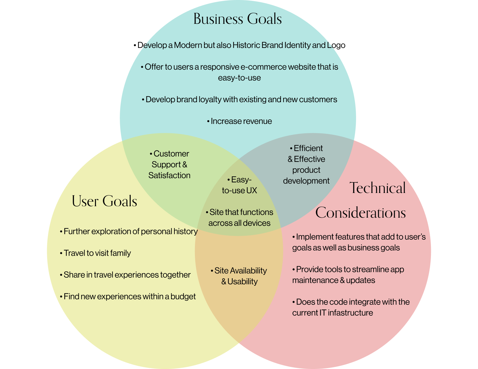
First, determined what Miles’ goals are and our own business goals. Then, for further clarification, we added in technical considerations.
Our focus should be on…
Customer support and satisfaction
Making an easy-to-use user experience
Response web
Ideate.
Brainstorm & Generate potential solutions.
Sitemap
This is the sitemap which shows a general outline of each page and feature of our website and how information will be organized.
Task Flow
Based off of Miles’ persona, we determined 3 different tasks he would need to complete using our website.
First in finding information on health and safety of time travel,
Then in finding family-friendly options based on his interests,
And finally, in booking the trip for his family.
This is meant to show his singular, ideal path through our website and how he can complete each task.
User Flow
This user flow is also based on the same three tasks. This is meant to outline all possible scenarios the user might navigate through the site in order to complete a task.
Low-Fidelity Sketches.
This is the original draft for our homepage layout based on our Persona’s goals, UI requirements, and competitive design patterns.
Mid-Fidelity Wireframes.
From left to right, we have created clear visual hierarchy and the key features necessary for the home page. This was also done for the onboarding page and destination page to keep consistency of design patterns.
Responsive Wireframes.
Then we took those pages and made sure they could be scaled into tablet and mobile formats and made adjustments accordingly.
Brand Identity.
Contemporary | Captivating | Trustworthy | Classic | Effortless | Uplifting
Typography.
Effortless & Trustworthy
Color.
Trustworthy, Uplifting & Classic
Logo Sketching.
As a reminder, we needed branding that was both modern but historical. This is sketched iterations of the Zeit logo.
Logo Ideation & Finalization.
In brainstorming, we determined that the logo needed to be Contemporary, Trustworthy and Classic. We played around with sketches, fonts, and different iterations until we eventually landed on the image of an hourglass. Which could also be reinterpreted into the ‘Z’ of the Zeit brand.
Zeit Brand UI Kit
An ever-changing database of UI elements to maintain a consistent brand identity.
Prototype.
Once we determined the UI elements, we then developed a mid-fidelity wireframe and reformatted into tablet and mobile for responsive design. This took us to the first step in developing our prototype.
Validate.
Once a prototype was created, we needed to proceed with testing its basic functions in a real-world setting so that we could identify errors and need for improvement.
Think Aloud Testing.
First we determined the objectives:
To test our mid-fidelity prototype via InVision app through think-aloud testing
Participants were between ages 30 to 70 and had a basic understanding of travel websites.
We wrote down our script and provided the tasks to the participants to complete.
Remote Usability Testing.
As with in-person think aloud testing, we proceeded similarly with remote testing. The objectives were:
To test our mid-fidelity prototype via InVision app through think-aloud testing through Zoom.
Participants were between ages 30 to 60 and had a basic understanding of travel websites.
We wrote down our script and provided the tasks to the participants to complete.
Affinity Map.
Like our empathy map from our 1-on-1 interviews, we detailed all of our observations on post-its and categorized them by similar features.
There was confusion in navigation icons.
The Find a Trip feature found difficulties in entering in the number of travelers. Additionally, the search results would not change with this added information.
As above, there was a similar problem in selecting specific dates. Again, this also did not seem relevant to the search results.
Finally, the dates and pricing section was found to be confusing in its format to some of the participants.
Priority Revisions.
Add verbiage to the navigation icons
Eliminate the calendar from the Find a Trip Feature
Eliminate the number of travelers from theFind a Trip Feature
Clarify the format for the dates and pricing section
Navigation Icons.
Before
After
Find a Trip Form - Calendar & Traveler selection.
Before
After
Pricing & Dates Form.
Before
After
Final High-Fidelity Prototype.
Reflections.
This project may have been challenging, but it was never boring. When I started, I was a bit overwhelmed by the scope of information I needed to get started. Since this was not a project scenario that was based in reality, beginning the research seemed impossible.
However, by spending so much time planning out and synthesizing research, I was able to understand exactly how I could bridge the gap between fiction and reality. And in doing so, I was excited to discover potential solutions for such an unexplored venture.
Miles-First Mentality. As I went through this process, I realized that Miles was my anchor. I got to know Miles and empathize with him and by extension, potential users of this site. By constantly considering our persona and his needs in all of my decision-making, I was able to focus my work and develop a more consistent and user-friendly product.
Next Steps.
Continue to maintain site and updating UI kit along the way to ensure that elements and details remain consistent and up-to-date.
Hand-off prototype and assets to developers and work closely to maintain business and user goals.


